Soulful CSS
CSS that doesn't just work — it feels right. Subtle differences that separate functional from beautiful.
overflow: hidden vs overflow: clip
They look the same. They are not the same.
overflow: hidden
- Clips visually but still creates a scroll container
- JS scroll (
scrollTo) still works - May leak edges with border-radius in some cases
overflow: clip
- Strict clipping, no scroll container at all
- Nothing scrolls — not even via JS
- Cleaner for masks & rounded UIs
TL;DR — if you don't need programmatic scrolling, reach for clip. It's the sharper knife.
Smooth Edges for Marquees with CSS Mask
Two Tailwind classes. That's it.
mask-l-from-80% mask-r-from-80%Works on card skeletons, marquees, or anywhere you want to smooth out hard content edges. The mask creates a gradient fade instead of an abrupt cutoff — way more polished.
Organic Shapes with 8-Value border-radius
border-radius can actually take up to eight values:
border-radius: 10% 5% 5% 10% / 5% 10% 10% 5%;The slash separates horizontal / vertical radii — letting you create all kinds of organic, blob-like shapes in pure CSS. Add blur + some layering and you get a fancy glowing loader.
Increase Click Area Without Messing Up Layout
Want to increase the click area without messing up your layout? Try :after with position: absolute + inset: -{value}px
This creates a larger, invisible hit area around the element, making it easier to click without changing the layout.
Fix Hover Bugs with Group Classes
You can achieve parent-child hover interactions using the Tailwind group class on parent and group-hover variant on target:
<div class="group">
  <div class="group-hover:translate-y-6"/>
</div>
Here is a breakdown of the target element within an exaggerated oversized parent wrapper:
Fix Dead Zones Between Stacked Elements
Ever notice small dead zones between closely stacked elements where clicks or hovers don't register? Fix it with a ::before pseudo element that extends the hit area vertically:
::before {
  content: "";
  position: absolute;
  inset: -10px 0; /* extends 10px vertically */
}
This creates an invisible buffer zone that eliminates those annoying gaps between list items, nav links, or any tightly stacked interactive elements.
Typography: text-wrap: pretty
Improve text readability and avoid awkward single words on the last line:
text-wrap: pretty;This CSS property makes text line breaks look more natural and professional, especially in headings and paragraphs.
Fix Ugly Autofill Backgrounds
autofill on inputs is ugly by default — the background bleed ruins clean design systems, especially in dark mode. Fix it with a pure CSS inset shadow hack:
autofill:shadow-[inset_0_0_0px_1000px_var(--color-background)]This forces the background color and kills the native blue.
Transitions vs Keyframe Animations
When it comes to interruptibility, CSS transitions and keyframe animations behave differently. Transitions interpolate toward the latest state and can be interrupted, while keyframe animations run on a fixed timeline and don't retarget once started.
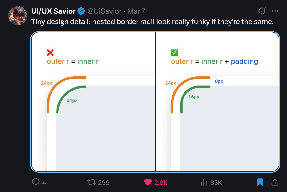
Nested Border Radii
Nested border radii look funky when they're the same value. The correct formula is outer r = inner r + padding.
Prevent Page Bounce with Multiple Scroll Containers
If your app contains multiple scroll containers, add this to your html/body to prevent the annoying "page bounce" effect:
overscroll-behavior: none;This prevents the browser's default overscroll behavior (like elastic scrolling on macOS) from interfering with your nested scrollable areas.
Text Wrapping: balance vs wrap
text-wrap: balance distributes text evenly across each line, avoiding orphaned words. Drag the slider to see how it reflows compared to the default.
text-wrap: balance;Animate Icons Contextually
When swapping icons (like copy → check), don't just pop them in. Layer opacity, scale, and filter: blur() for a polished transition.
Click each button to see the difference.
@keyframes icon-in {
  from {
    opacity: 0;
    transform: scale(0.5);
    filter: blur(4px);
  }
}
Make Text Crispy
macOS uses subpixel antialiasing by default, which makes light text on dark backgrounds look thick and blurry. One line fixes it.
Default font smoothing uses subpixel antialiasing on macOS
Grayscale antialiasing produces thinner, crisper light text
-webkit-font-smoothing: antialiased;

/* or in Tailwind: */
<body class="antialiased">
Add it to your root layout. Done forever.
Use Tabular Numbers
Proportional digits have varying widths — great for reading, terrible for counters and tables. Hit play and watch the numbers jump around, then flip to tabular.
font-variant-numeric: tabular-nums;

/* or in Tailwind: */
<span class="tabular-nums">{count}</span>
Split & Stagger Entering Elements
Instead of animating everything in at once, stagger elements using a --stagger custom property. Try all three modes — "Individual" feels the most alive.
Track expenses, build lasting habits
Monitor your spending and develop financial habits that stick.
Track expenses, build lasting habits
Monitor your spending and develop financial habits that stick.
Monitor your spending and develop financial habits that stick.
@keyframes enter {
  from {
    transform: translateY(8px);
    filter: blur(5px);
    opacity: 0;
  }
}

.animate-enter {
  animation: enter 800ms ease-out both;
  animation-delay: calc(var(--delay) * var(--stagger));
}
Make Exit Animations Subtle
Entrance animations mirror the full distance. Exit animations shouldn't. A short -12px slide + fade is softer than sliding all the way out.
/* Full exit — matches entrance, can feel jarring */
exit: { y: "calc(-100% - 4px)", opacity: 0, filter: "blur(4px)" }

/* Subtle exit — softer, less demanding */
exit: { y: "-12px", opacity: 0, filter: "blur(4px)" }
Align Optically, Not Geometrically
Equal padding on both sides of a button with an icon looks unbalanced — the icon side appears heavier. Shave a few pixels off the icon side.
The best fix is in the SVG itself — adjust the viewBox so no extra margin or padding is needed. But when you can't modify the icon, a small padding tweak does the job.
Use Shadows Instead of Borders
Borders are binary — they're either there or not. Multi-layer box shadows create depth that adapts to any background, especially with transparency.
Hover over the cards — shadows feel softer and adapt better to any background.
box-shadow:
  0px 0px 0px 1px rgba(0, 0, 0, 0.06),
  0px 1px 2px -1px rgba(0, 0, 0, 0.06),
  0px 2px 4px 0px rgba(0, 0, 0, 0.04);
Add Outline to Images
Images on similar backgrounds lose their edge. A 1px outline at 10% opacity with outline-offset: -1px creates subtle depth without looking like a border.
 Edge blends into similar backgroundsSubtle depth — consistent edge in design systems
outline: 1px solid rgba(0, 0, 0, 0.1);
outline-offset: -1px;

/* Dark mode */
.dark { outline-color: rgba(255, 255, 255, 0.1); }CSS-Only Carousel with Scroll Snap
You can create a CSS-only carousel with scroll-snap. When you scroll, it snaps exactly in the center of the card.
.scroller {
  overflow-x: auto;
  scroll-snap-type: x mandatory;
  scroll-padding-inline: 1.5rem; /* matches your scroll-pl/pr */
}

.card {
  scroll-snap-align: center;
  flex-shrink: 0;
}
Scroll Fade Masks with @property
Use masks for your scrollable areas. Use the CSS at-rule @property to register stops as animatable values. The browser treats your custom property as a percentage, so the mask edges transition smoothly.
Result: scroll lists that fade at the edges, revealing content underneath. No JavaScript needed.
CSS Custom Highlight API
The CSS Custom Highlight API lets you highlight search results — without affecting the DOM structure.
::highlight(search-results) {
  background-color: #ff0066;
  color: white;
}
::selection
You can override native text selection on a website with CSS using ::selection.
::selection {
  background: #dbeafe;
  color: #1e3a8a;
}

/* Firefox (older) */
::-moz-selection {
  background: #dbeafe;
  color: #1e3a8a;
}
For Tailwind CSS, use the selection: modifier to achieve the same result.
width: 100% vs width: stretch
With width: 100%, a margin pushes the element past its parent — you end up writing calc(100% - 20px) to claw the space back. width: stretch fills the remaining space after margins are accounted for. No math.
/* Before — overflows by the margin amount */
.box {
  width: 100%;
  margin: 0 10px;
}

/* After — fits the remaining space, no calc() needed */
.box {
  width: stretch;
  margin: 0 10px;
}
Text Shine Effect in Pure CSS
A clean shine effect using a gradient clipped to text. Animate the background position and the shine sweeps across.
.shine-text {
  background: linear-gradient(
    110deg,
    rgba(39, 116, 245, 0.2) 20%,  /* Text color */
    rgba(39, 116, 245, 0.9) 40%,  /* Shine glow */
    rgba(39, 116, 245, 0.9) 60%,  /* Shine glow */
    rgba(39, 116, 245, 0.2) 80%   /* Text color */
  );
  background-size: 200% auto;
  animation: shine 2s linear infinite;

  background-clip: text;
  -webkit-background-clip: text;
  -webkit-text-fill-color: transparent;
  color: transparent;
}

@keyframes shine {
  to { background-position: 200% center; }
}
Viewport Units: vh vs svh vs dvh
On mobile, the URL bar and toolbar slide in and out as the user scrolls — which means the "viewport height" actually changes. Picking the wrong unit is what causes footers to get cut off or layouts to jump while scrolling.
100vh— The classic. Ignores the mobile toolbar entirely, so footer content gets cut off and you have to scroll to reach it.100dvh— Dynamic viewport. Updates live as the toolbar shows/hides. You see the whole footer, but the layout shifts while scrolling.100svh— Small viewport. Locked to the smallest possible viewport (toolbar visible). No layout shift, full footer always visible. Usually what you want.
/* Old — footer cut off behind mobile toolbar */
.page { min-height: 100vh; }

/* Live-updating — but layout jumps while scrolling */
.page { min-height: 100dvh; }

/* Best default — footer always visible, no shift */
.page { min-height: 100svh; }